
Web Redesign | Unión Personal
About Unión Personal
Aims to achieve the highest level of well-being for its beneficiaries by leveraging all available resources and creativity to position itself at the forefront of Argentina’s social health insurance system.
Mission:: To provide all members with high-quality medical services.
Vision: To become a leading reference within the Argentine healthcare system, supported by continuous growth based on experience, infrastructure, and the human quality of the people who make up the organization.
Why did we redesign it?
Online management has become one of the most widely used options for many of the organization’s members.
At the same time, competition in this area continues to grow, advancing in the development of platforms optimized for completing procedures and administrative tasks, with a strong focus on user needs.
After identifying the website’s main drawbacks, the redesign focused on improving the interface and navigation in order to enhance usability and provide features that deliver real value to users.
How did we approach it?
Design methodology: Based on The Five Elements of UX by Jesse James Garrett
Strategy
Research
Requirements
Define
Structure
Ideate
Skeleton
Prototype
Surface
Design
Strategy
Research into user needs and business goals
User satisfaction with the product was assessed through semi-structured qualitative online interviews with 13 users of the Unión Personal website.
9 out of 13 users reported difficulty finding what they were looking for.
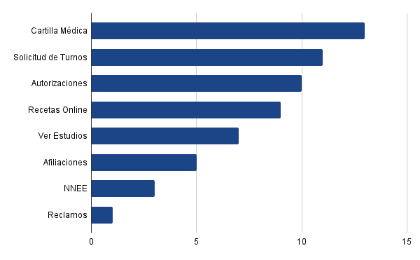
Most used features
Age range
16 to 85 years old
Región:
7 de 13 – CABA
4 de 13 – GBA
2 de 13 – Interior
80% of users reported being dissatisfied with the website’s performance.
Insights
Interviewed users emphasized that the platform does not work properly, is not intuitive, and makes it difficult to find information. Many users also stated that the homepage is often confusing.
It was also identified that the website lacks essential elements for completing important procedures, such as a Digital Membership Card and clear information or documentation requirements needed to complete transactions available on the platform.
What did users say?
“It would be ideal to complete all my procedures from home without wasting time going to an office or waiting two hours to be answered by the call center.”
“I don’t find it hard to use, but it feels quite ugly and boring.”
“It would be great if the provider directory allowed filtering by area or proximity instead of checking one by one.”
“The appointments shown on the website are not the same as the ones you get when you call the call center.”
“The website is useless—nothing can actually be completed. On top of the time I waste there, I still have to go to an office, because nobody ever answers the phone.”
Lean UX Canvas
Understanding the current challenges of the platform and the business in order to define hypotheses for potential solutions.
1. Business problem
- Poor navigation usability
- Login credentials are not remembered
- No virtual assistant or help chat available
- Self-service homepage for appointments and prescriptions is not clear or easy to use
- Lack of information and outdated content
- Poor information architecture and category structure
User archetypes
- Users across a wide age range, from 16 to 85 years old, who want to self-manage administrative procedures, appointments, and/or prescriptions online through the website.
6. Hypotheses
Users will feel more familiar and comfortable with the platform, making it easier to use. This will increase satisfaction by improving navigation and access to information, reducing frustration, and potentially turning the platform into the primary management channel.
The number of active users will increase, and usability will improve for older users.
User experience and content organization will improve, prioritizing what users consider important based on their needs.
5. Solutions
- Interface redesign with aesthetic improvements, using a clean and organized layout to make it more user-friendly
- Save login credentials for automatic access
- Reorganize content to improve visibility and site navigation
- Prioritize, organize, and update information, including the homepage and menus
- Reduce the number of options to optimize users’ decision-making time
- Improve self-management of appointments and prescriptions, enhancing usability and clarity
- Maintain consistency across screens
- Implement a virtual assistant or chat to provide optimal and personalized support
7. What is the most important thing we need to learn?
- How well users adapt to the implemented changes
- Reduction in reliance on alternative contact channels
- Availability and effective management of appointments
- Proper creation and management of online prescriptions
- Adequate responses to users’ questions and/or complaints
- User satisfaction with the platform’s proposed functionalities
2. Business outcomes
- Increased user retention and loyalty
- Growth in platform usage
- Higher user satisfaction and recommendations
- Reduced congestion in physical offices and phone lines
- Fewer complaints
4. User outcomes & benefits
- Time optimization
- Satisfaction from completing procedures easily
- Online solutions without needing alternative channels
- Simplified management with relevant information readily available
- Personalized and effective support
- Better control over personal healthcare
8. What is the minimum amount of work needed to learn the next most important thing?
- Surveys and interviews
- Prototype design
- Usability testing
- Satisfaction, effectiveness, and efficiency metrics
- Heuristic evaluation

User Persona
Who are we designing for?

Olga
Retired – 82 years old
Neuquén
Bio
Olga continued with the health insurance provider after retiring because she was given the option to redirect her PAMI contributions.
She has been a member for over 50 years and has all her medical records and clinical history with Unión Personal.
Goals & needs
Resolve her questions and concerns from the comfort of her home, with access to personalized support
Manage prescriptions and medications without having to travel to healthcare centers in Buenos Aires, where her medical records are stored
Be able to use and understand the website easily and intuitively
Motivations
Request prescriptions from home and collect medication at local pharmacies, without needing to book a medical appointment or travel to obtain it
Authorize medical services with local providers through self-management, obtaining consultation vouchers within the same process
Receive better guidance and communication through the platform
Frustrations
An outdated and incomplete provider directory, forcing her to travel to an office to obtain accurate information
Appointments available through self-service are limited to the organization’s own centers in Buenos Aires
Lack of tools that make the experience optimal, useful, and pleasant—often leaving her unsure where to go to find the information she needs
Journey map
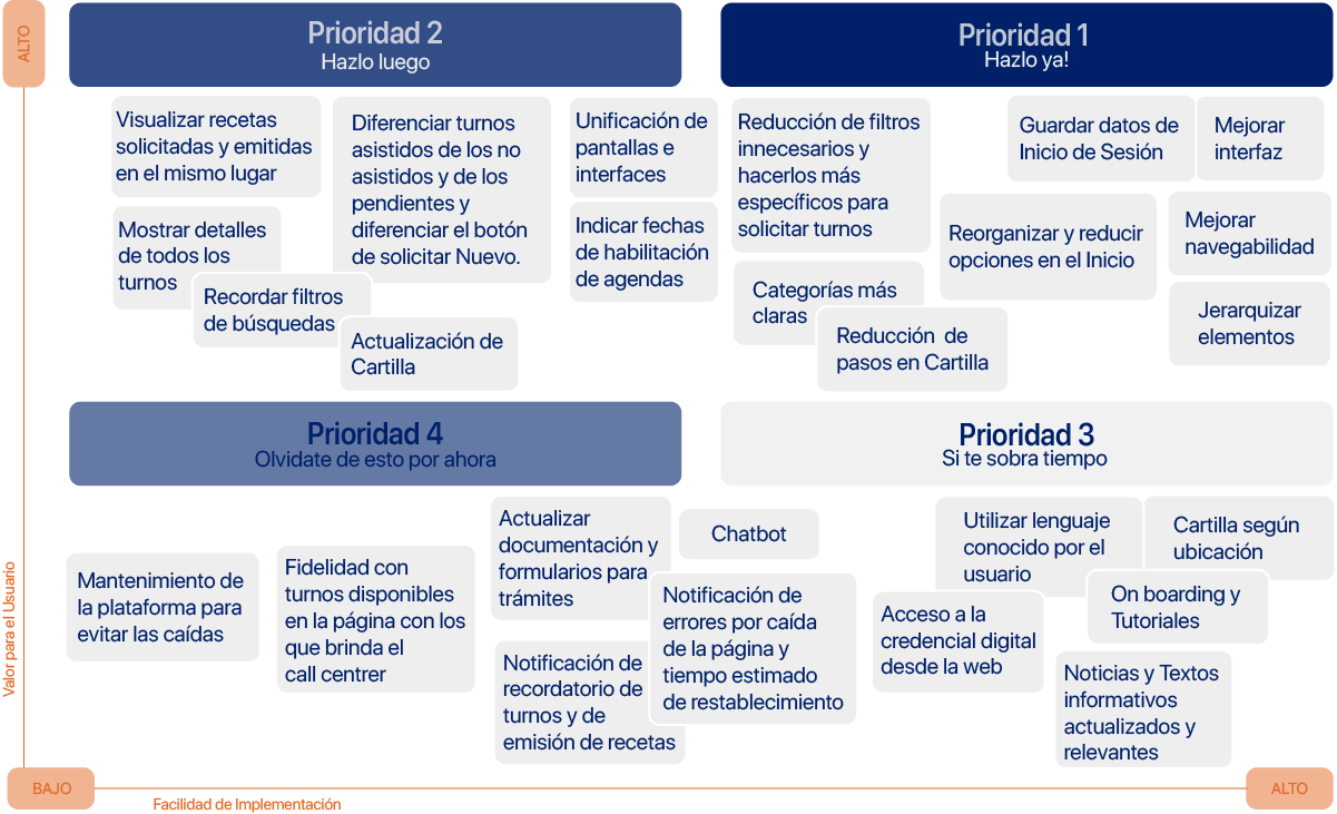
Let’s understand what users expect from the product, the difficulties they encounter throughout the experience, and the emotions these situations generate. This allows us to identify pain points, opportunities for improvement, and potential solutions.
Pain points
By identifying the main pain points, the following solution hypotheses were developed:
- Optimize appointment booking and the provider directory
- Design a more friendly and intuitive interface, using language familiar to users
- Reduce steps and filters for the most frequently used features, requesting only relevant information
- Clearly differentiate categories and options
- Reduce the number of options displayed on screen
- Update existing information and add missing content
- Unify interfaces and ensure consistency across screens
- Onboarding and tutorials
- Improve information hierarchy
- Digital membership card
Requirements
Proposals and definitions of functionalities for the redesign. The project scope is defined.
Based on the existing information architecture of the Unión Personal website, a Tree Testing study was conducted to identify user pain points, understand navigation errors, and improve them.
Task 1
You need to submit gynecological test results to a doctor who works at the CEMAC center in the Caballito neighborhood. You contact the call center and are instructed to book the appointment through the website.
What steps would you follow to schedule it?
Task 2
You requested prescriptions through the self-service system but did not receive the confirmation email. Now you need to buy the medication, but you must print the prescriptions first.
What steps would you follow to obtain them?
50%
Only 50% of users were able to successfully book the requested appointment, indicating that the user path is not intuitive and the information is difficult to find.
40%
Only 40% of users were able to complete the task. Once again, the interface proved to be unintuitive and the information poorly organized. Users faced too many options and steps, requiring navigation across multiple screens to reach the desired action.
FVD Matrix
Feasibility – Viability – Desirability
Based on the identified pain points and their subsequent analysis, priorities were defined in order to address user needs effectively.
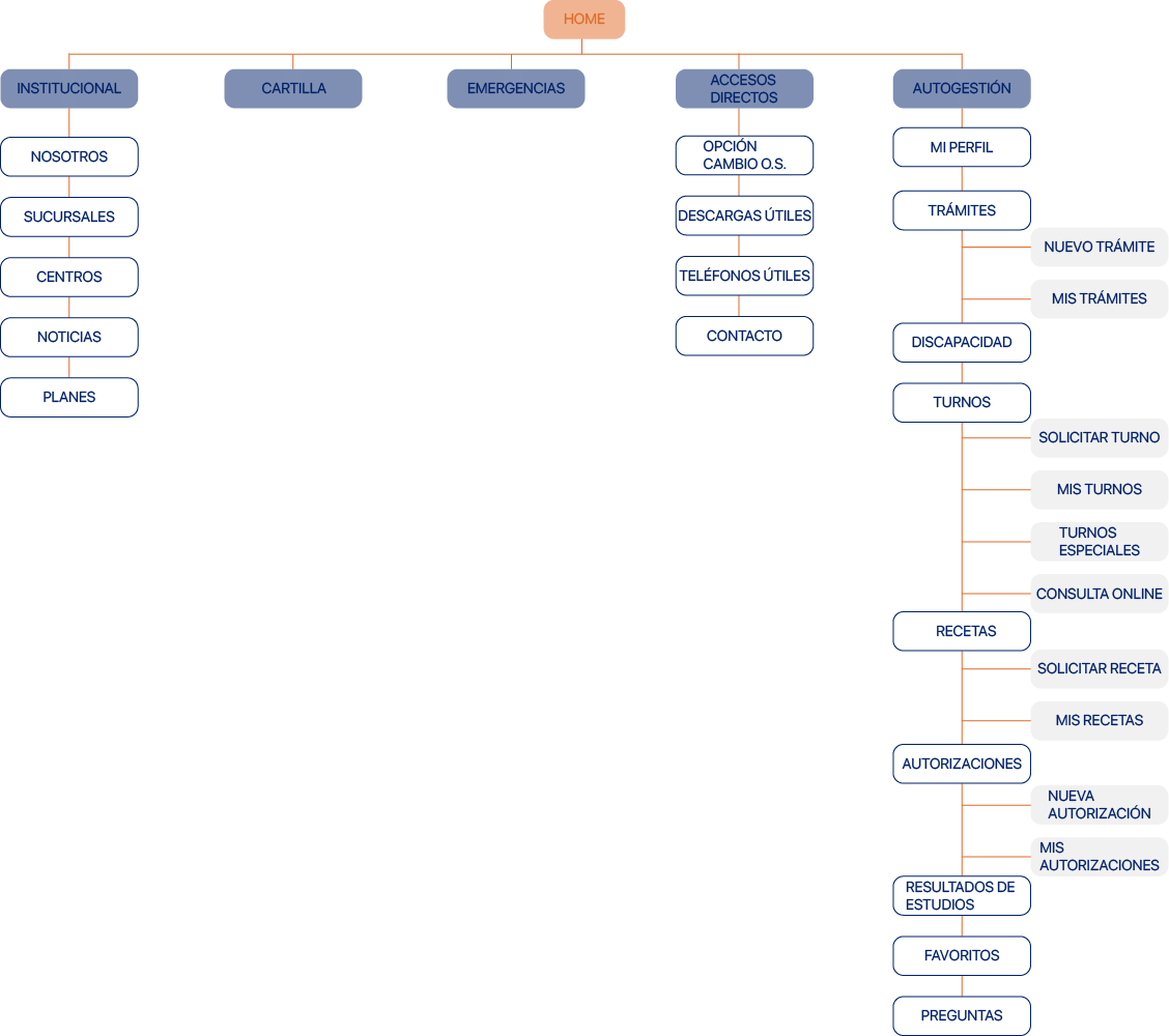
Structure
Content organization
Based on the results obtained and the analysis conducted, a new information architecture was designed.
Taskflow
We defined the new paths users will follow to complete their tasks.
Taskflow 1
The user wants to book a gynecology appointment at the organization’s own medical centers.
Taskflow 2
The user is looking for a pediatric emergency service in the southern area.
Taskflow 3
The user wants to check the status of their medical prescription request and print it if it has already been processed.

Skeleton
Wireframes and wireflow
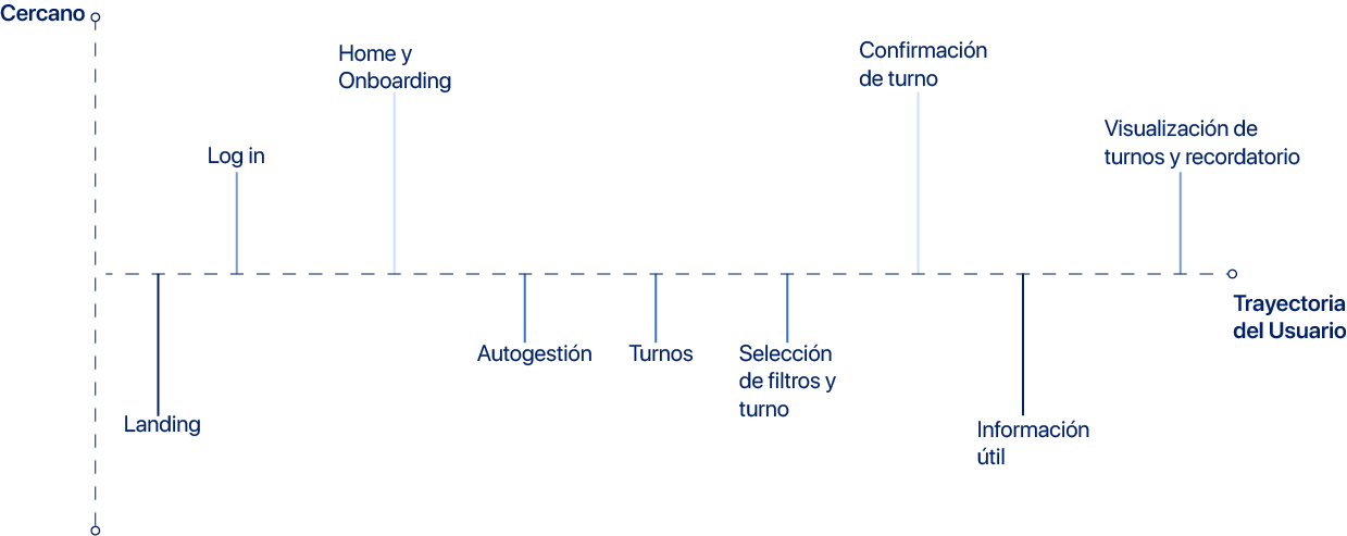
We will analyze the user journey for Task 1 (Appointment booking) through a sequence of screens.

Surface
Visual design
Golden Circle
We defined the company’s purpose, motivation, philosophy, and value proposition.

Why
The mission is to provide all members with high-quality medical services, becoming a leading reference within the Argentine healthcare system through continuous growth and technological advancement.
How
General
Web platform providing access to medical and administrative services
Appointment management. Self-service. Healthcare
Specific
Human-centered approach, experience, and infrastructure
Simple and accessible processes. Reliable and secure platform. Efficient, centralized, and comprehensive self-management
Identity
Effectively ensure user satisfaction.
What
A web-based self-service platform that allows users to complete all types of procedures and inquiries quickly and efficiently from the comfort of their home
Optimization of user experience and interface to facilitate online processes and information discovery
Access to all health insurance procedures and verified information for the entire family group
Voice matrix
How the brand identity is communicated
| Secure | Efficient | Reliable | Intuitive | |
|---|---|---|---|---|
|
Concept |
Protection of personal and sensitive data. Confidential and easy to access. |
Easy access to information and procedures. Useful and practical tools. |
Verified and up-to-date information. Trustworthiness in processes. Quality of service and support. |
Clear categories and options. Simple, transparent, and accessible |
|
Verbosity |
Clear, concise, and easy-to-understand wording. |
Clear, concise, and easy-to-understand wording. |
Clear, concise, and easy-to-understand wording. |
Clear, concise, and easy-to-understand wording. |
|
Vocabulary |
Accurate and precise. Formal, attentive, and informative. |
Accurate and precise. Practical, direct, and informative. |
Direct and accessible. Personalized and informative. Formal yet approachable. |
Safe, simple, direct, and easy to understand. |
|
Grammar |
Concise sentences |
Concise sentences |
Simple, easy-to-understand sentences with clear messaging. Transparent. |
Short, concise sentences. |
|
Punctuation |
Uses punctuation marks. Avoid exclamation and question marks.
|
Uses punctuation and question marks. Avoid exclamation marks. |
Uses punctuation and question marks. Avoid exclamation marks. |
Uses punctuation marks. Avoid exclamation and question marks.
|
|
Capitalization |
Only at the beginning of sentences and for proper nouns. |
Only at the beginning of sentences and for proper nouns. |
Only at the beginning of sentences and for proper nouns. |
Only at the beginning of sentences and for proper nouns. |
Tone matrix
Tone used by the brand when addressing users based on their journey
Style guide
Communication style: best and worst practices
| Temática | Description | Best practices | Worst practices |
|---|---|---|---|
|
Headings |
Left-aligned and color-accented. Clear and concise. |
✅ Self-service Access – Prescription History |
⛔ View previously requested prescriptions Go to appointments |
|
Sections | Categories |
Keywords. Short and familiar |
✅ Provider Directory – Emergencies – Prescriptions – Appointments |
⛔ Healthcare Providers – Medical Prescriptions – Booking at Own Centers |
|
Copys |
Concrete and descriptive supporting information. |
✅ Online Medical Consultation is now available. You can try it by clicking here. |
⛔ You can now request an online interconsultation with professionals from our own centers. Access via Self-service > Appointments > Online medical consultation |
|
Notifications |
Formal, respectful, yet friendly. Short and informative. |
✅ Online Medical Consultation is now available. You can try it by clicking here. |
⛔ When no appointments are available, the schedule appears in gray and the user cannot perform any actions. |
|
Error messages |
Clear and brief explanation of the error, indicating how to proceed. |
✅ The entered ID number does not match an active member. Please try again. |
⛔ Unhelpful or unclear messages such as “Incorrect data.” |
|
Success messages |
Clear and precise confirmation that the task was completed successfully. |
✅ Your appointment has been successfully confirmed. Go to “My Appointments.” |
⛔ “Registered” / “Requested” / “Generated” |
|
Dates & times |
Day, number, month, and year. Time in 24-hour format. |
✅ Friday 03/02/2023 13:30 |
⛔ 03.02.2023 / Friday, February 3rd 1:30 PM |
|
Buttons |
CTAs and action buttons. |
✅ Translucent or gray when inactive. Solid color when enabled. Clearly indicate the action to be performed.
|
⛔ Unclear buttons. Inconsistent color or size. |
|
Inputs |
Form fields and search inputs. |
✅ Encourage searching or data entry. Guide the user. “Enter or select a specialty.” |
⛔ Does not indicate what the user should do or enter. “Search.” |
Prototype 1.0

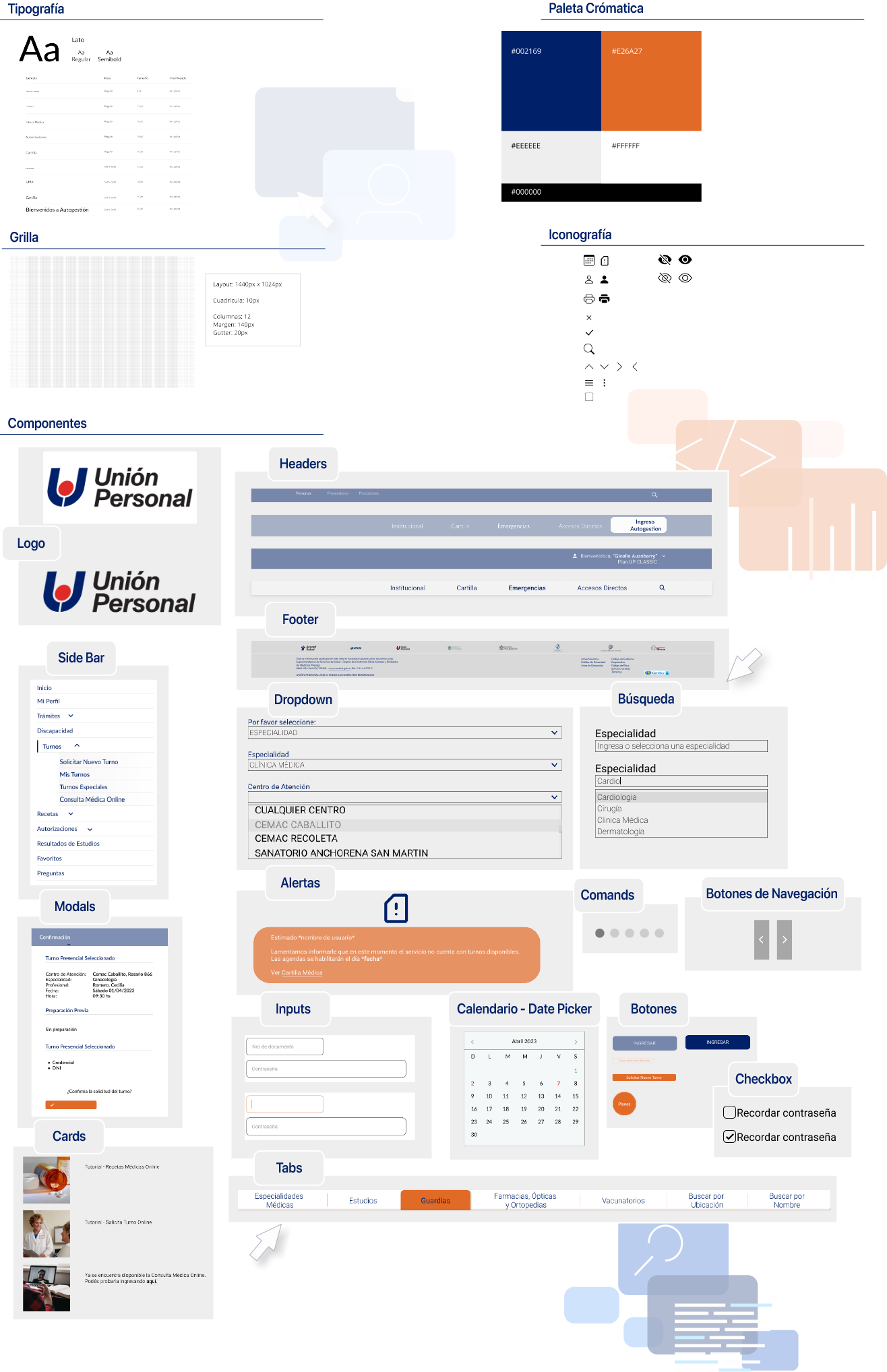
Design system
Visual proposal for the brand identity
Purpose & shared values
Reliable
A website where users feel comfortable and safe. A platform that conveys trust and closeness, especially important for a health-focused service.
Effective
A website that meets all user needs, being functional and clear. Accessible anytime, from anywhere.
Simplicity
Fast and straightforward processes. Clear, accurate information with well-defined categories and options that are easy to understand.
Design principles

Consistency
All elements belong to the same system and are consistently applied across the entire interface.

Simplicity
Minimalist design. Clear and concise content, providing only the necessary information in an easy-to-understand way for users.

Intuitive
User needs are addressed intuitively, allowing tasks to be completed successfully without difficulty.

Accessibility
An optimal and efficient experience. User-centered design that supports usability for all types of users, considering different needs and abilities.
Usability testing
In order to validate the findings, a prototype based on the new redesign proposal was created and evaluated through usability testing.
Moderated remote testing – Insights
Platforms:
– Zoom
– Figma
Users:
4 Unión Personal members, aged between 20 and 70, familiar with the platform.
Residents of CABA and GBA.
U1 Leo, 31 years old
U2 Marcela, 54 years old
U3 Lis, 25 years old
U4 Hebe, 69 years old
Task 1
Self-service access and medical appointment booking at CEMAC
Success criteria:
– Successfully log in
– View appointment confirmation message
Was it successful?
100% of users completed the task successfully.
Task 2
Searching for cardiology providers in the directory
Success criteria:
– Correctly access the provider directory
– Apply the appropriate filters to find a cardiology specialist and view their office details
Was it successful?
100% of users completed the task successfully.
Task 3
Requesting and printing medical prescriptions
Success criteria:
– Correctly complete the request form
– View confirmation message
– Understand the Prescriptions menu and reach the print option
Was it successful?
100% of users completed the task successfully.
What worked
- Fast and smooth login and registration process
- Intuitive interface and clear language understandable for all users; copy successfully guided users
- All users found the content they expectedAll users found the content they expected
- All users completed tasks successfully and with ease
- All users agreed they would use the platform as their primary tool and would recommend it
- Simple provider directory with few steps and clear filters
- Optimized Appointments and Prescriptions menus
What didn’t work
- Appointment booking limited to the organization’s own medical centers, excluding private providers
- Lack of a chatbot or virtual assistant
1 out of 4 users had difficulty returning to the homepage after booking an appointment - Tasks took slightly longer than expected; although successful, 2 out of 4 users completed them through an alternative path
- 1 out of 4 users expressed discomfort with the color palette used in the interface
Conclusions
Based on participant feedback, the redesign received a positive response. The platform fulfills its purpose, is intuitive, and easy to use.
While most users had no navigation issues, the following points were identified for consideration:
- Additional email reminders beyond the online confirmation
- Clearer definitions of certain terms not familiar to all users
- Direct access to family group information and member credentials without switching profiles (primary account holder)
- In the future, the color palette could be adjusted to better align with a healthcare-focused concept
Despite the prototype’s fidelity limitations, users expressed satisfaction when testing the platform. They reported finding the information they expected, feeling comfortable using it in their daily lives, and stated they would recommend it to new users.
Redesign

Prototype