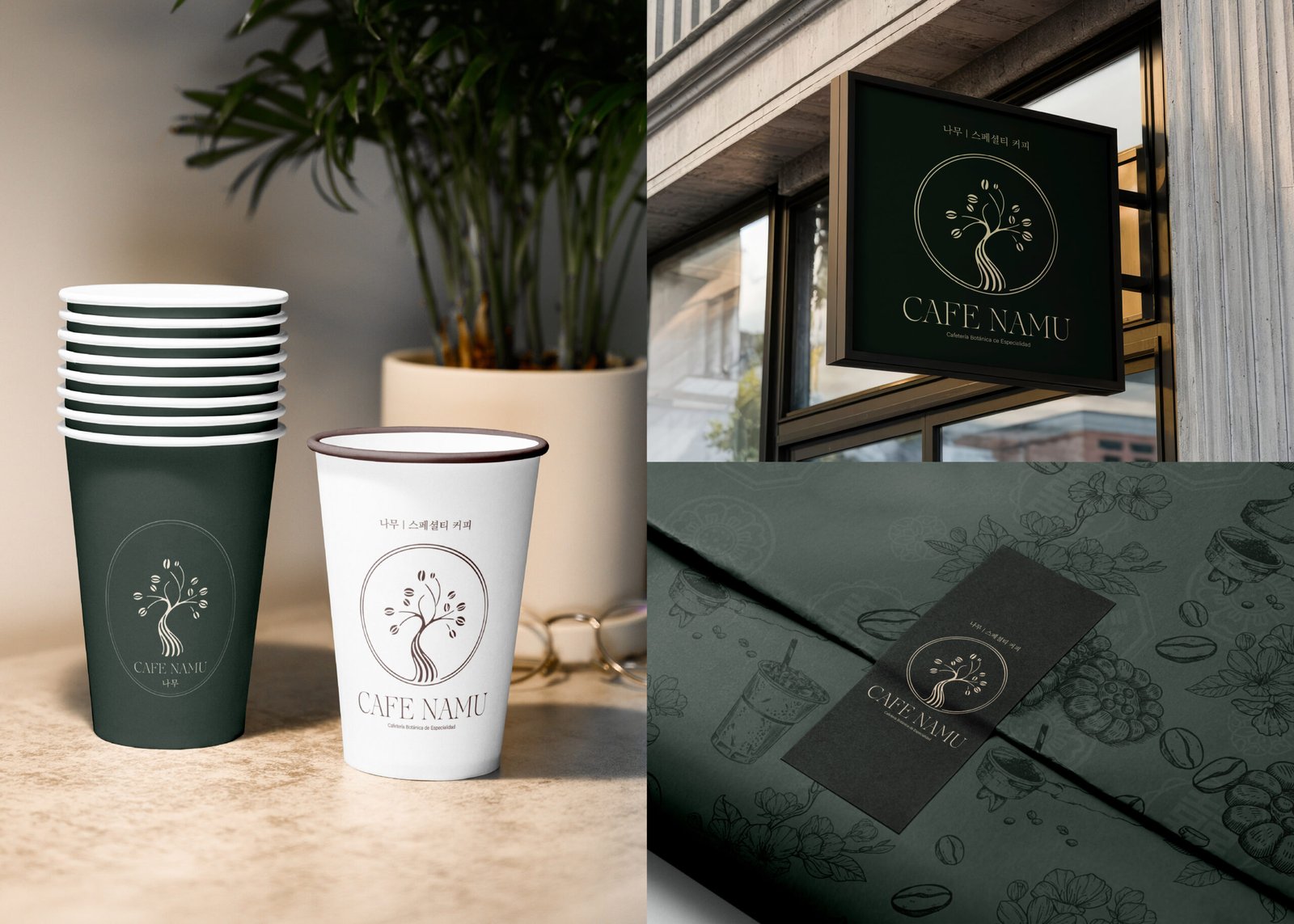
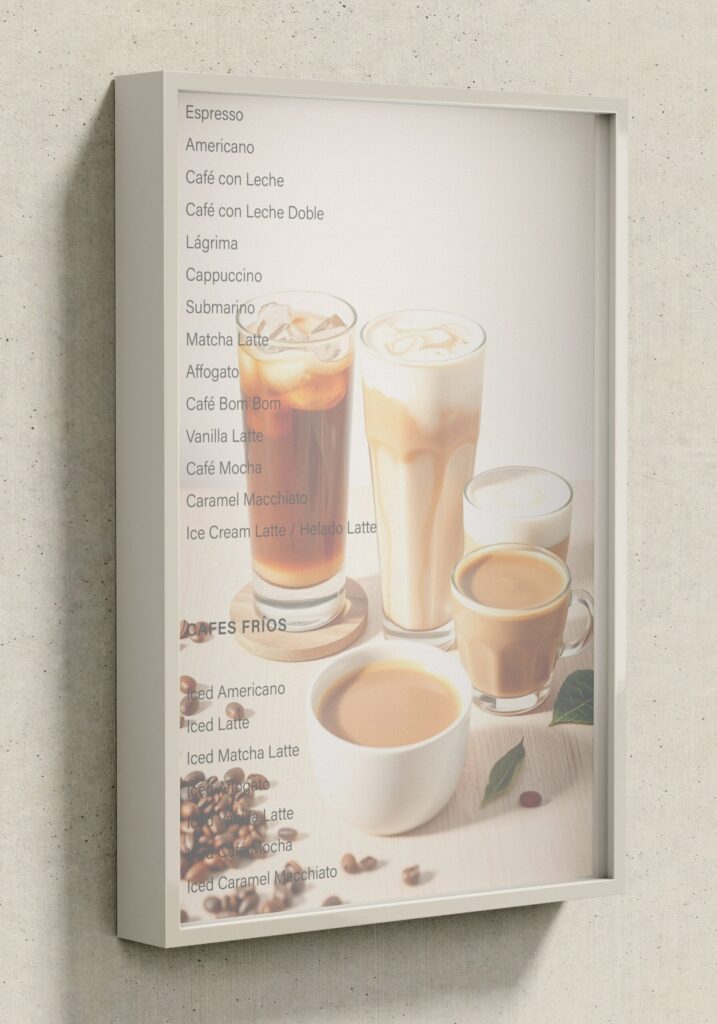
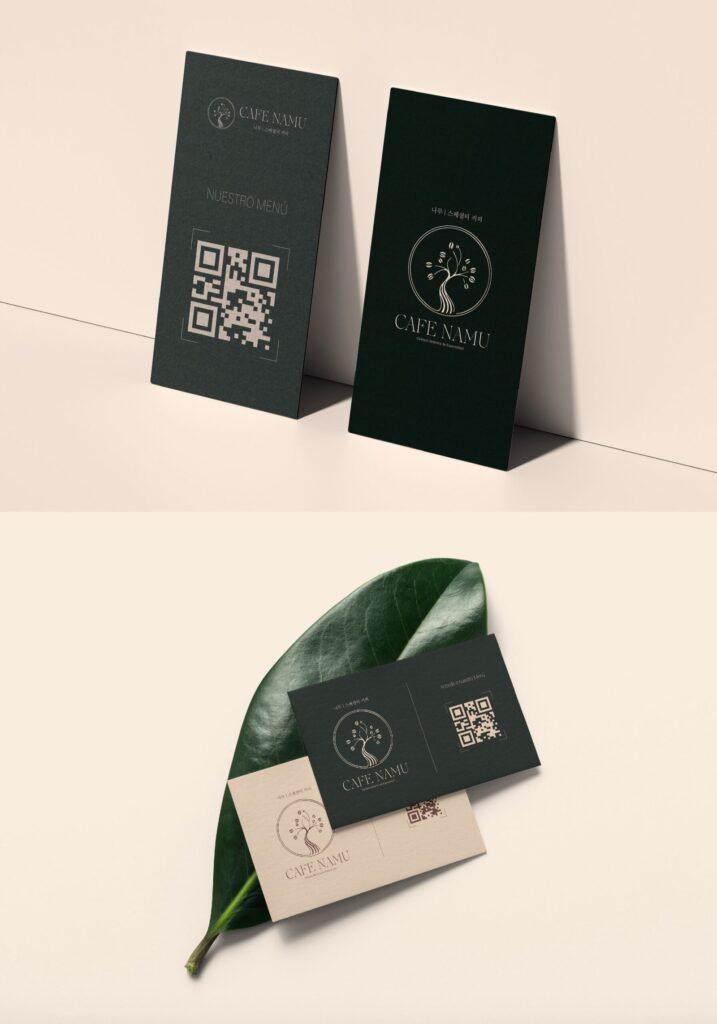
Namu Coffee

Branding | Brand Identity & Strategy

A botanical brand with a Korean soul and a natural essence

Visual Identity • Logo Design • Brand Applications • Brand Guidelines

Context

About the Project

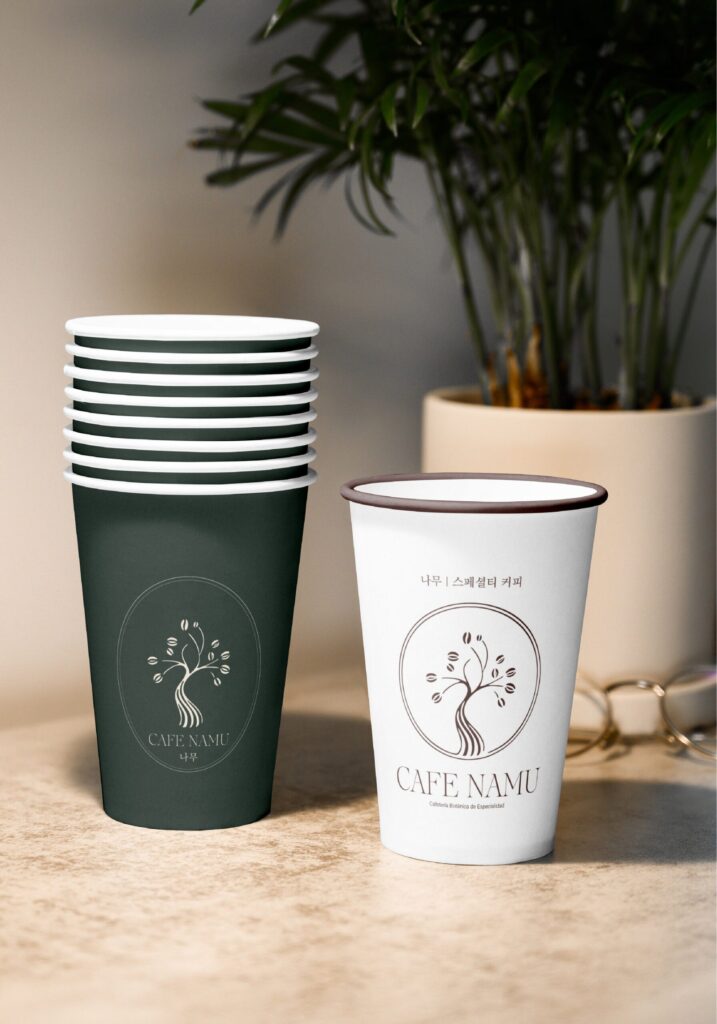
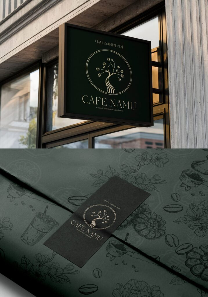
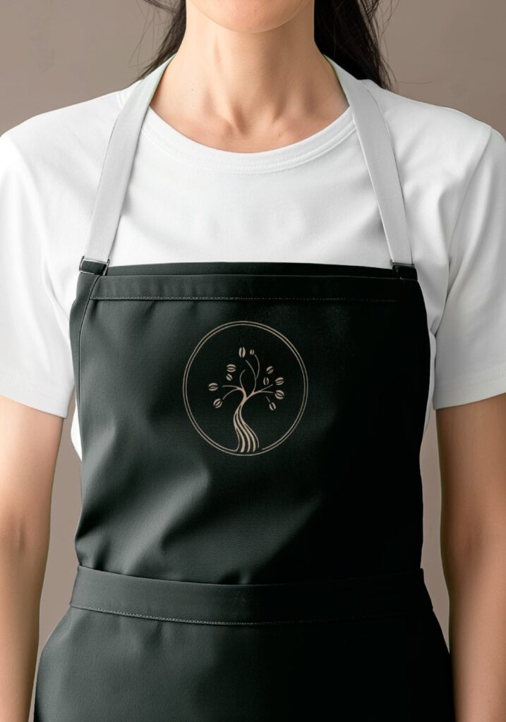
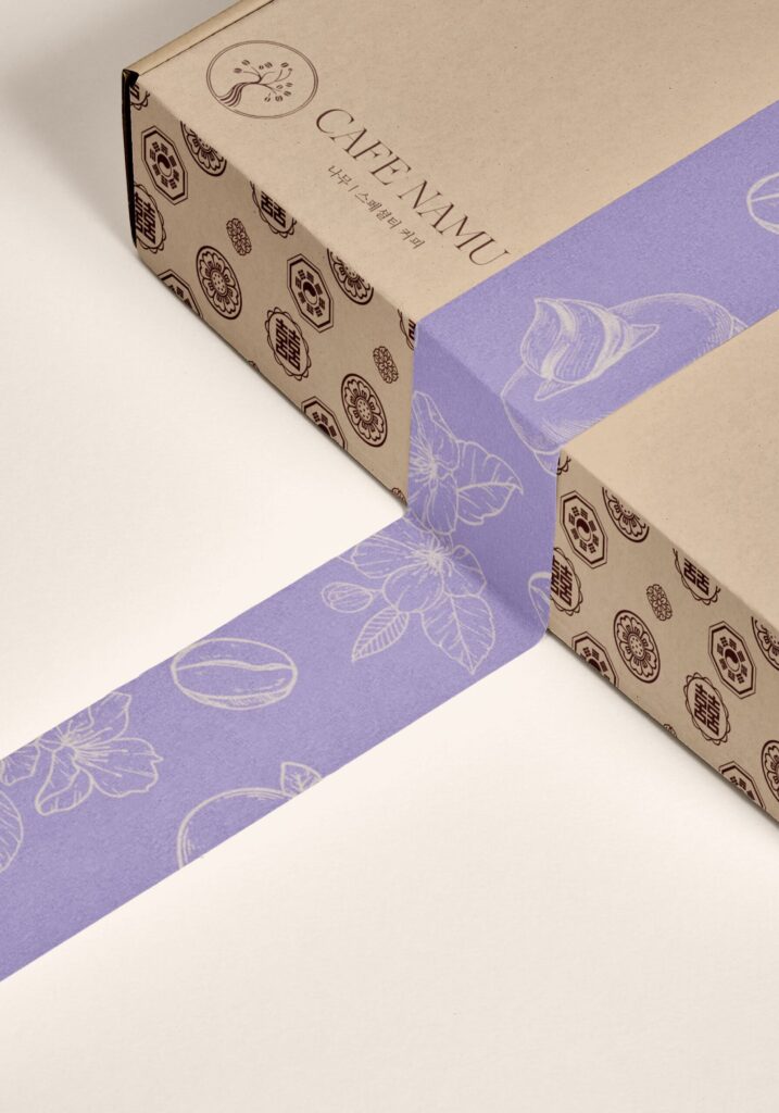
Café Namu was conceived as a space where calm, nature, and Korean culture come together. The name “Namu” (나무), meaning “tree” in Korean, symbolizes growth, connection to the earth, and organic beauty.

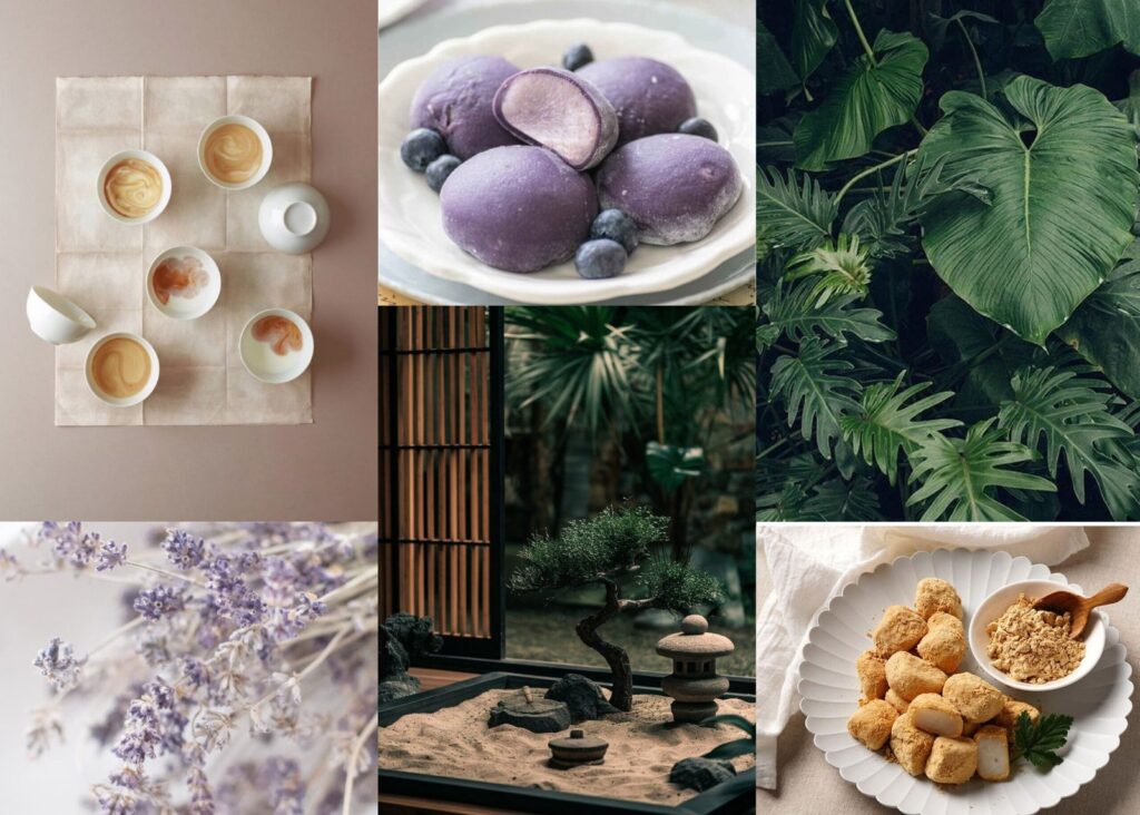
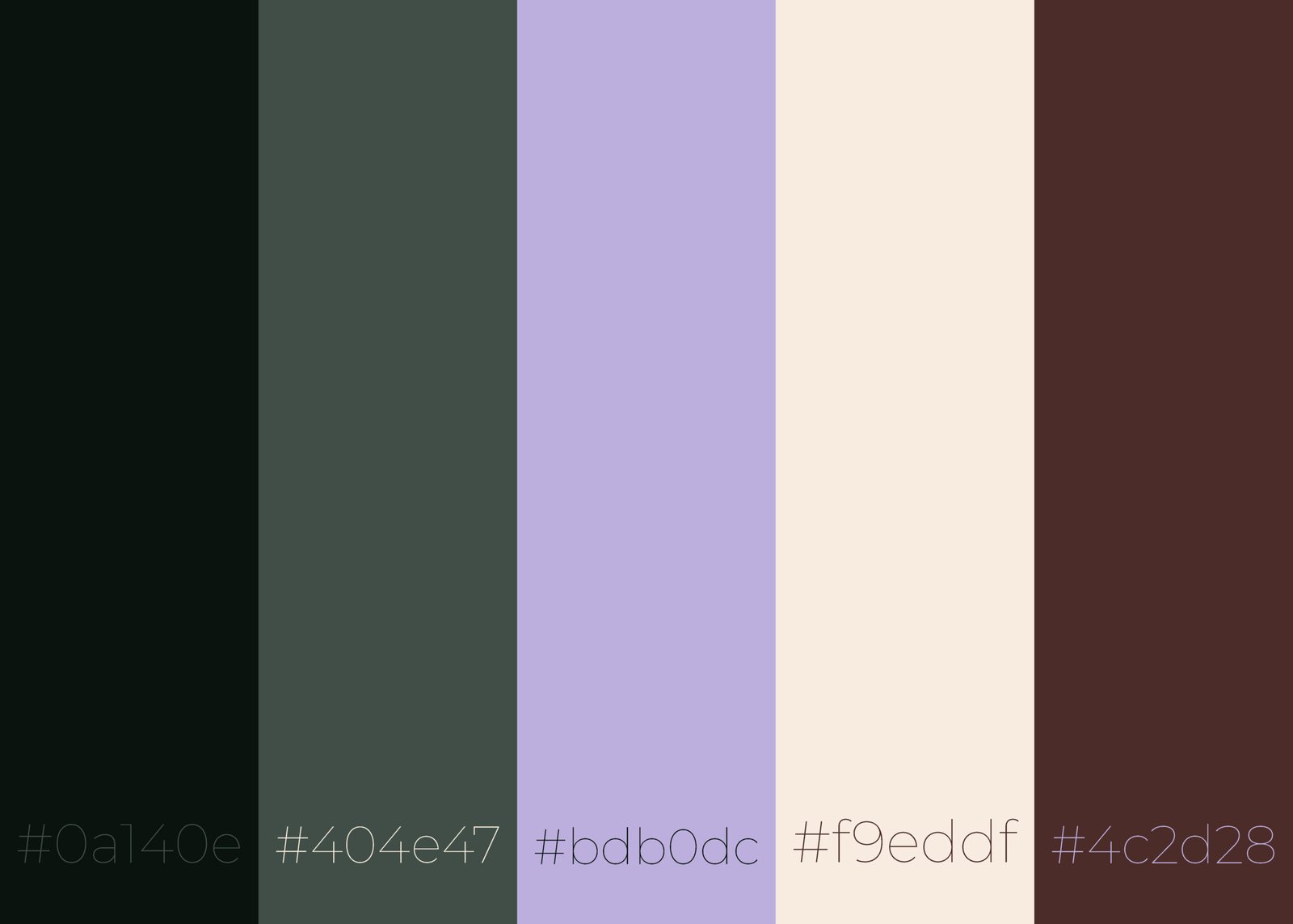
The challenge was to create a serene and authentic visual identity capable of balancing contemporary minimalism with Korea’s traditional aesthetic sensibility. Inspired by handcrafted ceramics, botanical textures, and a natural design philosophy, the brand conveys a timeless elegance and a deeply organic spirit.

Creative process

From concept to implementation, every detail was carefully designed to bring a coherent and meaningful identity to life.

Visual exploration

Inspired by natural textures, Korean ceramics, and botanical imagery, the visual identity reflects organic elegance and deep cultural authenticity.

Color palette

A harmonious range of natural, delicate tones that evoke balance, calm, and a strong connection to the organic world.

Typography

The typographic system balances elegance and clarity, combining a refined serif, a functional sans serif, and Korean typography that reinforces the brand’s cultural identity.

Final design 

Visual identity

A serene, organic identity inspired by the harmony between nature and culture.

Outcome

A contemporary visual identity that conveys Café Namu’s botanical and serene essence.
Through a balanced composition of Korean tradition and minimalist design, the brand achieves an authentic, coherent, and refined presence.
Its visual system—built around soft tones, natural materials, and harmonious typography—invites a warm, calm, and deeply organic experience.