
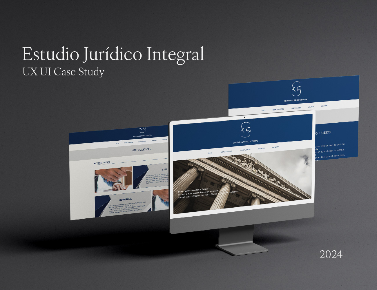
About the Project
UX/UI design for a website for a full-service law firm based in Buenos Aires, specializing in legal and tax advisory services for individuals and companies, both locally and internationally.
The goal of the project was to improve information clarity, facilitate contact with potential clients, and reinforce a sense of professionalism and trust through a simple, accessible digital experience aligned with the firm’s values.
Role
UX/UI Designer
Responsibilities
User research · Information architecture · Flow definition · Interface design · Prototyping
Tools
Figma · FigJam · Google Forms
Project type
UX/UI Case Study
Problem
Users experienced difficulties finding key information about the firm’s services and understanding how to initiate contact.
Unclear navigation and a lack of content hierarchy negatively impacted the experience and weakened the perception of trust from the first interaction.
Solution
A clear and well-structured navigation system was designed, prioritizing quick access to essential information and simple contact flows.
The visual design was conceived to convey professionalism, security, and institutional consistency, ensuring a smooth experience across both mobile and desktop devices, while establishing a solid foundation for future technical implementation.
Design process
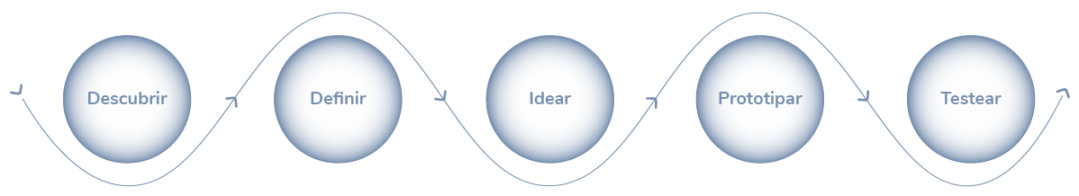
UX Research
Surveys & Interviews
Surveys and interviews were conducted with 33 participants from Argentina and Europe to understand needs, expectations, and trust criteria when searching for legal services online.
The research focused on identifying usability barriers, key information for decision-making, and expected features in a legal and tax advisory website.
Participants

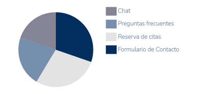
Most used features
Most requested information
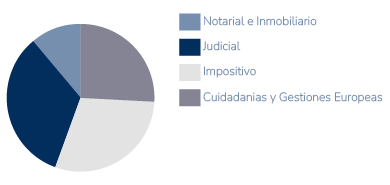
Most requested information
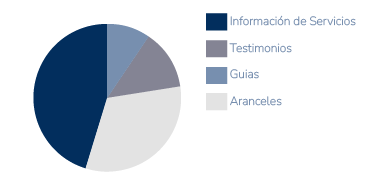
Key insights
Quick and visible contact
65% prioritize ease of contact through clear forms and appointment booking options.Trust built on evidence
40% look for testimonials and success cases to validate the firm’s experience, especially in citizenship processes and tax-related procedures.Clarity before interaction
60% need clear, well-structured information before initiating contact.Specialization in international procedures
More than 50% of users seek advice related to citizenships and international administrative processes.Value of an integrated service
50% prefer firms that combine legal and accounting advisory services, perceiving them as more efficient and trustworthy.
These insights guided decisions around information architecture, contact flows, and content hierarchy across the website.
Lean UX Canvas
Product problem
- Difficulty finding clear information about the services offered.
- Lack of a holistic approach and detailed descriptions of each practice area creates uncertainty and leads to lost conversion opportunities.
- Websites fail to convey trust and security.
- Users may question the firm’s credibility.
User archetypes
- Business owners and SMEs
Individuals with European ancestry, both Argentine and European - Individuals seeking notarial or inheritance-related services
- International users interested in private international law or European administrative procedures
- Lithuanian community
Solutions
- Firm overview including vision, professional profile, and highlighted practice areas
- Detailed descriptions of each service, from legal advisory to accounting services and citizenship processes
- A comprehensive presentation of the firm that communicates its integrated approach and user benefits
- Implementation of an optimized contact form and an online appointment booking system, including virtual consultations
- Access to chat via WhatsApp and direct phone contact
- Guides or FAQ sections providing clear steps for common procedures
- Testimonials and success stories to increase user trust
Product outcomes
- A website that delivers a clear and efficient experience
- Detailed service descriptions
- Easy-to-use contact tools
- Clear communication of the firm’s integrated approach .
- The product should increase user trust, facilitate access to information, and improve conversion rates through key features
User outcomes & benefits
- Clarity and trust: Detailed service descriptions help users understand how the firm can assist them
- Immediate access: Contact through optimized forms and online appointment booking
- Integrated solutions: Legal and accounting issues resolved in one place, simplifying the process
Hypotheses
- If the website provides clear service descriptions and facilitates communication, users will be more likely to trust the firm and initiate inquiries or book appointments.
- Users value an integrated presentation of the firm and prefer solutions that combine legal and accounting advisory services in one place.
What matters most
- Clarity and access to information: Ensuring users can easily find the services they need and understand the value the firm provides
- Ease of contact: Allowing users to book appointments or contact the firm effortlessly from any device
Tools
- Surveys and interviews
- Prototype design
- Usability testing
- Satisfaction, effectiveness, and efficiency metrics
- Heuristic evaluation
User understanding
User persona & Empathy map
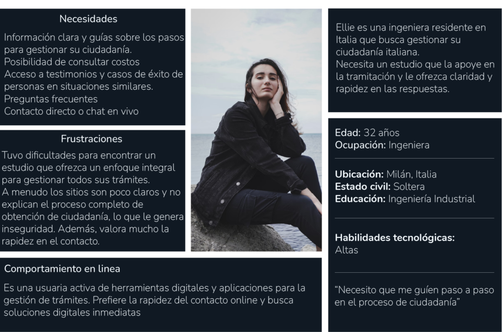
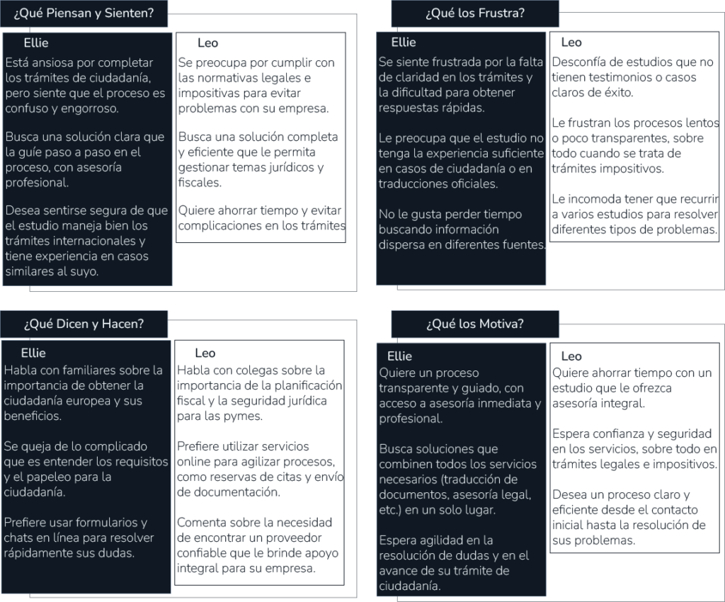
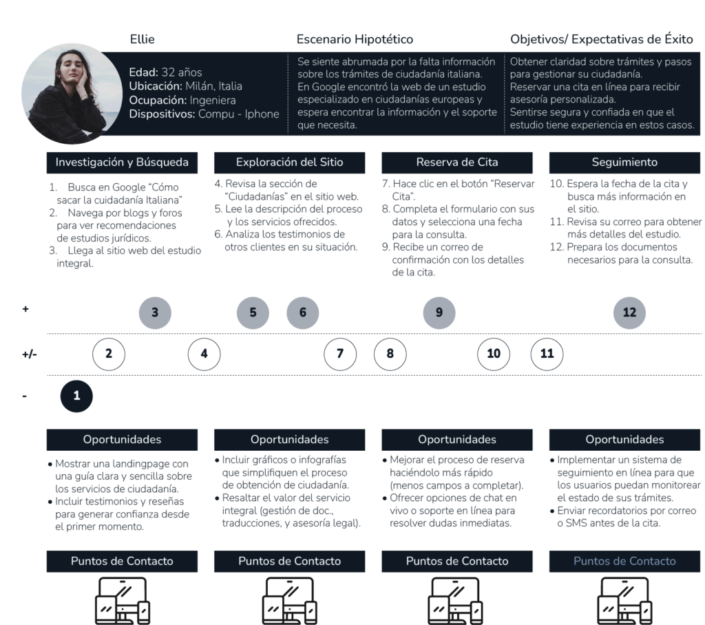
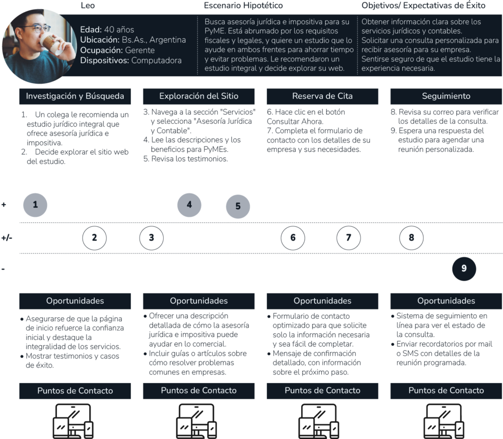
Two representative user profiles were defined to better understand behaviors, needs, and expectations when seeking legal and tax services, both locally and internationally.
Eliana Giselle
Leonardo Andrés
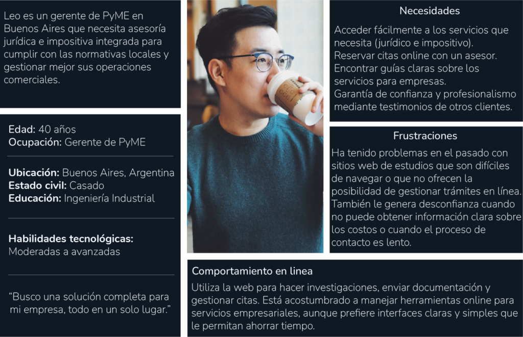
The empathy analysis helped identify patterns of frustration, motivations, and expectations that directly impact the perception of trust and service clarity.
Journey map
It made it possible to visualize the complete user journey, identify friction points, and uncover opportunities for improvement at key moments of interaction with the website.
Design criteria
Based on research and user journey analysis, the following criteria were defined for the product design:
Quick access to clear and relevant information s
Building trust through visible credentials and testimonials
Simple and accessible contact flows
Clear explanations of services and processes
Support for international users
Transparency in pricing and service stage
Design decisions
Task flow
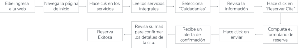
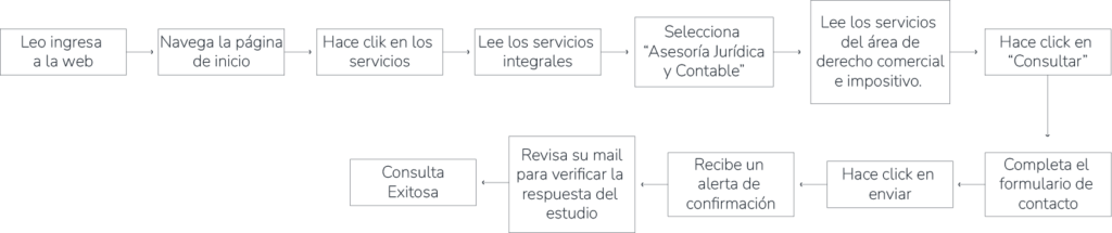
Task flows were defined for the main scenarios, prioritizing fewer steps, clear user paths, and ease of contact.
Ellie | Citizenship management
Leo | Legal & accounting advisory
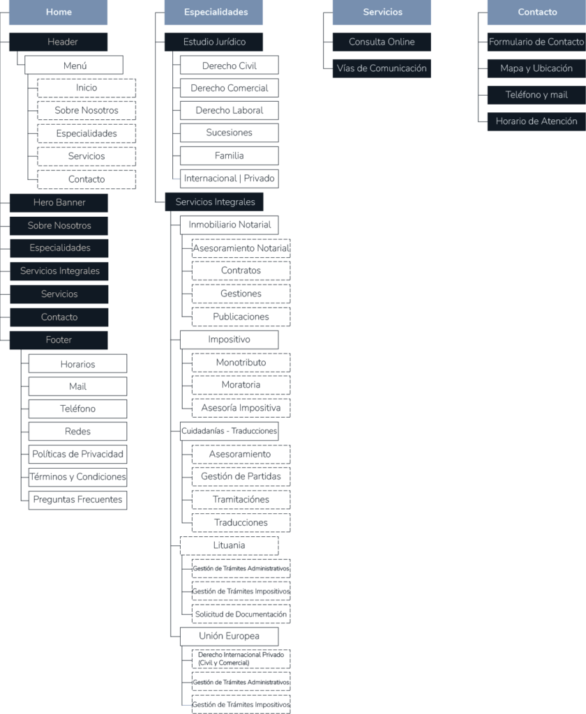
Information architecture
The information architecture was designed based on the defined criteria, organizing content in a clear and hierarchical way to facilitate understanding of the services and access to contact points.
UI | Visual Design
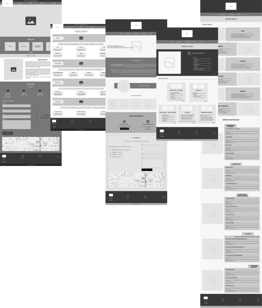
Wireframes - Low-fidelity
Design patterns
Low-fidelity wireframes were created to define the overall site structure, content hierarchy, and primary navigation patterns.
This stage made it possible to validate information organization, contact flows, and service distribution before moving into visual design.
Design system
A design system was defined to convey professionalism, trust, and clarity, ensuring visual consistency across the entire interface.
The system establishes clear rules for typography, color, grid, and components, supporting scalability and product coherence.
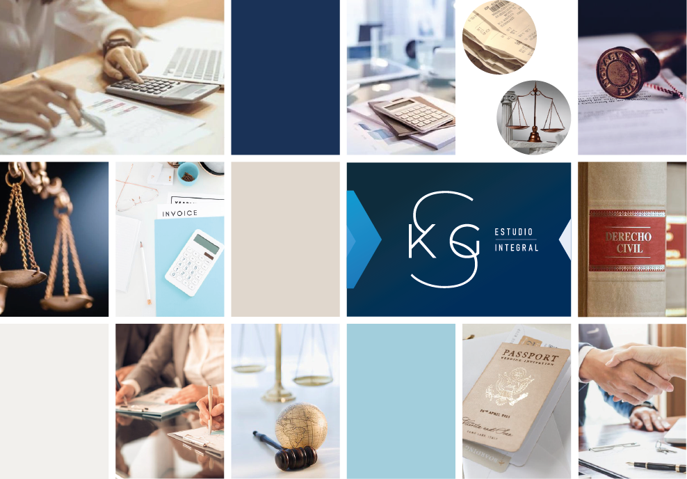
Moodboard
Components
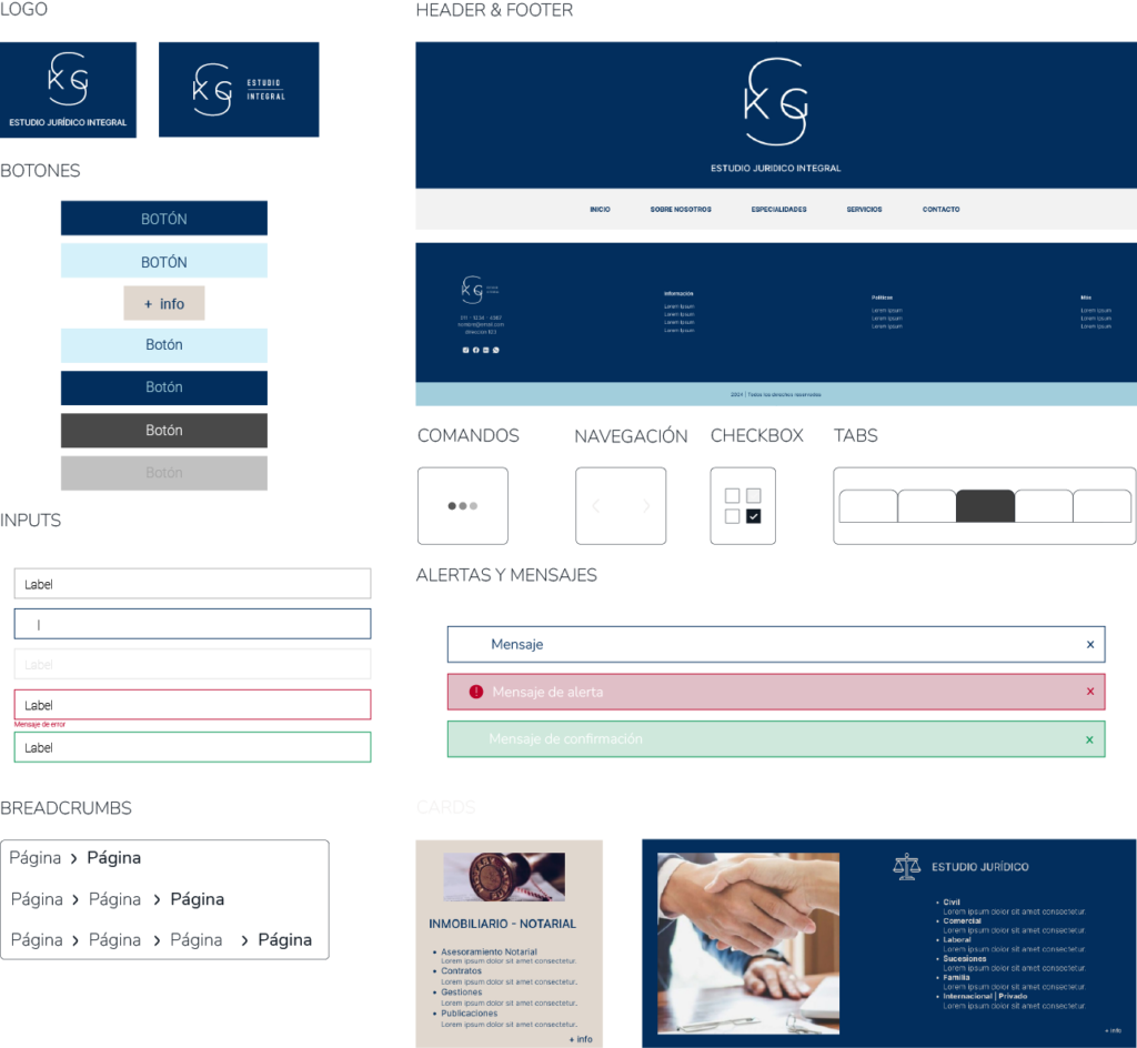
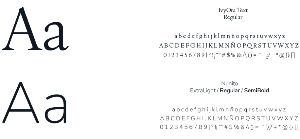
Typography
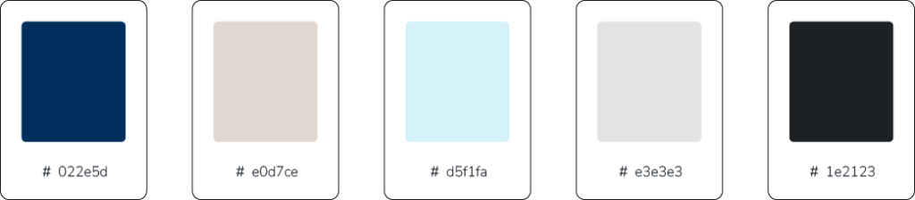
Color palette
Iconography

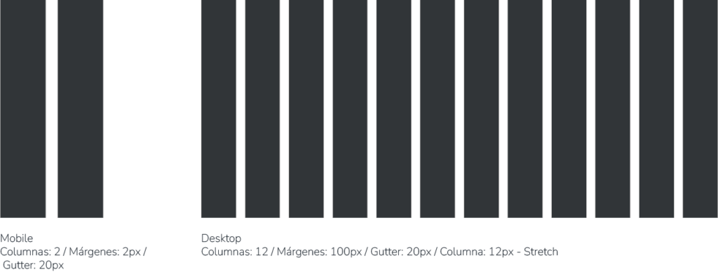
Grid
Validation & testing
Usability testing was conducted to evaluate service comprehension, ease of contact, and the site’s perceived level of trust.
The results helped identify opportunities for improvement in navigation, booking processes, and information clarity, which were incorporated before advancing to the final design.
Usability testing
Moderated remote testing with five participants aimed at evaluating accessibility, navigation clarity, and overall ease of use of the website.
Task 1
Service exploration & trust in information
Objective
Evaluate ease of navigation and clarity of information organization. Assess service accessibility and whether the content inspires trust.
Scenario
“You are looking for advice regarding a potential European citizenship process. Find the relevant section and review the information. At the end, comment on whether the information feels accessible, trustworthy, and easy to understand."
Task 2
Booking an appointment for legal advisory
Objective
Assess the effectiveness and clarity of the appointment booking flow. Evaluate the user experience when completing the form.
Scenario
“You now need legal advice for a business-related matter and want to book an appointment online. Complete the booking process.”
Task 3
Contact & information verification
Objective
Observe accessibility and ease of use of the contact form, and whether the requested information is clear.
Scenario
“You want to make a quick inquiry about notarial services. Find and complete the contact form on the website.”
Findings
Positive results
Service understanding & navigation
Four out of five participants clearly understood the services offered after exploring the landing page and specific sections.
Perception of trust
Users perceived the site as professional and containing comprehensive information. As an opportunity for improvement, they noted the absence of visible references to professional experience and client testimonials.
Contact form
All participants found and completed the form without difficulty, rating it as clear and easy to use.
Issues identified
Citizenship section accessibility
Three out of five users did not easily identify the citizenship section. The section title was only visible on hover, which hindered immediate discovery.
Appointment booking
Although the booking flow was completed successfully, two participants expressed the need to specify the reason for the consultation in advance, given the limited appointment time.
Recommendations
Citizenship section
Make the section title permanently visible and use hover states only as a visual reinforcement.
Experience & testimonials
Expand the “About the firm” section by adding success cases and client testimonials to reinforce credibility.
Appointment booking
Include an optional field allowing users to briefly describe the reason for the consultation prior to the meeting.
Conclusions
The tests demonstrated a clear and functional design, with a high task completion rate.
- The identified improvement opportunities allow for further optimization of the overall experience and reinforcement of trust perception.
- Implementing the recommended adjustments contributes to a more accessible, clear, and conversion-oriented experience, strengthening the site’s value as a professional contact channel.
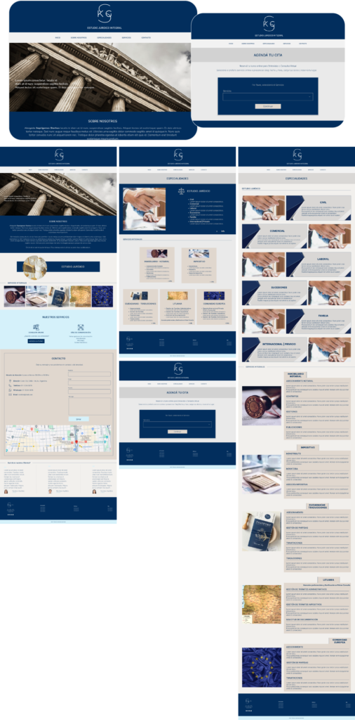
Final Design
The final design integrates the decisions made throughout the process, combining a clear structure, a consistent interface, and a professional aesthetic aimed at building trust.
The result is a coherent digital experience aligned with the firm’s goals and users’ needs, facilitating access to information and contact from the very first interaction.
Functional prototype
2024
Thank you for viewing it through to the end